Thursday, April 16, 2020
Demand the Epi Curve!
Today, President Trump and the “experts” outlined their plan to reopen the economy. Fundamental to this is seeing 2 weeks of sustained decline in COVID-19 cases. So, which graph are they going to use? The graph of cases by report date (the typical one you see) like this one where you don’t see a 2 week decline?
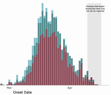
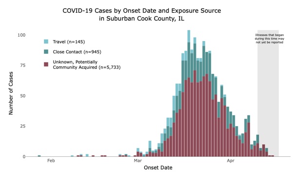
Or the epi curve, i.e., the graph which shows the date of onset of symptoms which is what actually shows the progress of the outbreak (and the one that’s really hard to find for most states and localities)? Like this one, which shows a sustained decrease for an entire month:
Both show the same underlying data but the first one is basically useless because 1) people aren’t getting tested until they’re sick enough to go to a hospital, which is usually 1-2 weeks after onset of symptoms and 2) there has often been long delays in getting the results of test, as much as a week or more.
Presumably the testing result delays will be coming down more and more with the back log going away and the new fast tests, but we still need to base decisions about reopening the country based on the epi curve. But that doesn’t look scary enough. We need graphs with big scary looking red blobs!
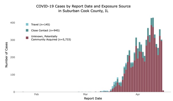
Here’s the latest from Chicago but it’s by reporting date. They don’t show you the epi curve anywhere that I can find:

It looks just like the same graph from suburban Cook County and so there’s every reason to believe that the epi curve would look just as good if they would show it to us!
This thing is already basically over. IT’S TIME TO REOPEN ILLINOIS!